

Talk to our experts
In an era when enterprise mobility has scaled new heights of achievements, page loading speed is crucial in determining the success of any eCommerce business. In a research, it was observed that approximately 40% of mobile users take themselves off from a web page if it takes a longer time to load. In order to reduce the page load time on mobile devices, Google introduced AMP in 2015. It came up with mobile search algorithm update in 2016 and started highlighting Accelerated Mobile Pages (AMPs) in its mobile search results. Shorter load times can help eCommerce retailers to improve their web performance and visibility on Search Engine Results Page (SERP) of Google.
A Brief Introduction of AMP
- AMPs are open-source protocols that speed up pages loading on mobile browsers. AMP HTML pages can load 15-85% faster than non-AMP pages.
- AMP – an extremely powerful version of HTML, supports various ad networks.
- Data consumption reduces eight times when you load AMP than an average web page.
- The AMP links appear with gray lightning-bolt featuring logo along with the tag “AMP” in Google search results.
- AMP pages can be easily activated on websites built on Magento, Drupal, WordPress and on many other popular CMS.
Is AMP different from responsive web design?
Both AMP and responsive web design make use of the same programming languages – CSS, JavaScript, and HTML, but both are used to achieve different goals. A responsive web design is a method of developing websites that can be easily accessed by users on any mobile device. On the contrary, AMP is a web framework that aims to deliver remarkable speed and quality content to users.
While the responsive websites are created by redesigning the existing website whereas, implementation of AMP can be done easily on existing websites without the need of redesigning.
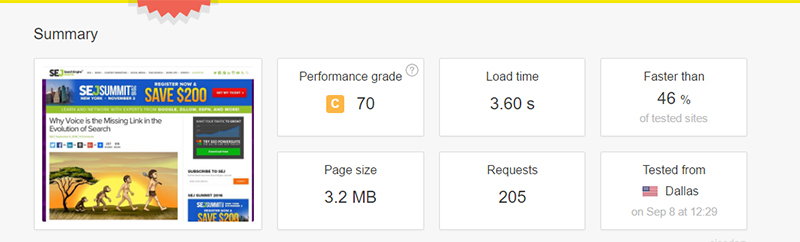
Performance Report of a Responsive Page
Image Source: Search Engine Journal

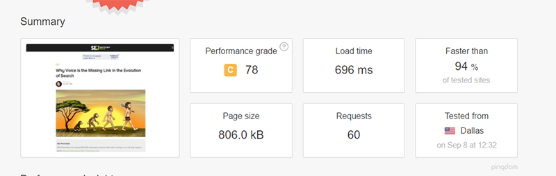
Performance Report of the AMP Version of the Same URL
Image Source: Search Engine Journal

Benefits of AMP for eCommerce Businesses
Let’s see how AMP can help eCommerce businesses to grow.
Reduced Bounce Rate
One of the reasons why visitors leave the site is – slow page loading. AMP enhances the user experience by improving page load speed. It leads to a reduction in the bounce rate and increases the average time a visitor spends on a site.
Increased Effectiveness of Online Advertising Campaigns
According to a research, eCommerce businesses that used Accelerated Mobile Pages in their online email campaigns observed 200 percent increase in click-through rates and 18 percent increase in ad performance. The higher the click-through rates, the higher will be the customer engagement.
Improved Search Engine Visibility
Faster loading speed increases the visibility of the pages in the organic search results of Google. That means your store will appear in top search when customers perform a mobile search to look for the items.
New Insights About Customers
AMP enables businesses to track video engaging, clicks, conversions, number of returning and new visitors. AMP also offers built-in support for Google Analytics that helps you get some new insights and devise strategies accordingly.
Monetizing Your Website is Easy with AMP
Websites are generally loaded with ads to generate more revenue which, in turn, increases the load time. Some users install ad blockers to load sites faster. With AMP, sites with an abundance of ads can load quickly as AMP supports an extensive range of ad technologies, networks, and formats, therefore ensuring effective ad monetization on the mobile web.
Most of the customers prefer to do shopping from their mobile phones and they want pages to load really fast. Here, AMP proves its worthiness. AMP enables users to quickly navigate and easily read the content, avoiding pop-ups in articles. Moreover, all your SEO activities without AMP are in vain.
Since Google supports AMP, one should also go for Accelerated Mobile Pages to bring more success to eCommerce business. For now, there are no clear indications that AMP will impact ranking soon, but we hope that it will be a key ranking factor in the future and become the new standard for the mobile web.
Ranosys, a trusted IT partner and Accelerated Mobile Pages (AMP) development company with presence in Singapore, UK (London) and USA, has comprehensive experience of about a decade in offering enterprise mobility solutions. Our skilled AMP developers have competence in making your existing page AMP and implementing the best AMPs, regardless of your industry vertical. We are keen to offer excellent service at the first place. Connect with us.
- #ACCELERATED MOBILE PAGES
- #ADVANTAGE
- #AMP
- #BOOST
- #BUSINESS
- #ECOMMERCE
- #MAGENTO


